
6. Why Simplicity Feels More Luxurious
If you want a watch to look “expensive” in a photo, it’s easy: add layers, add textures, add shiny details that scream for attention. It’ll pop for five seconds. Then you get bored, or you start noticing things don’t line up.
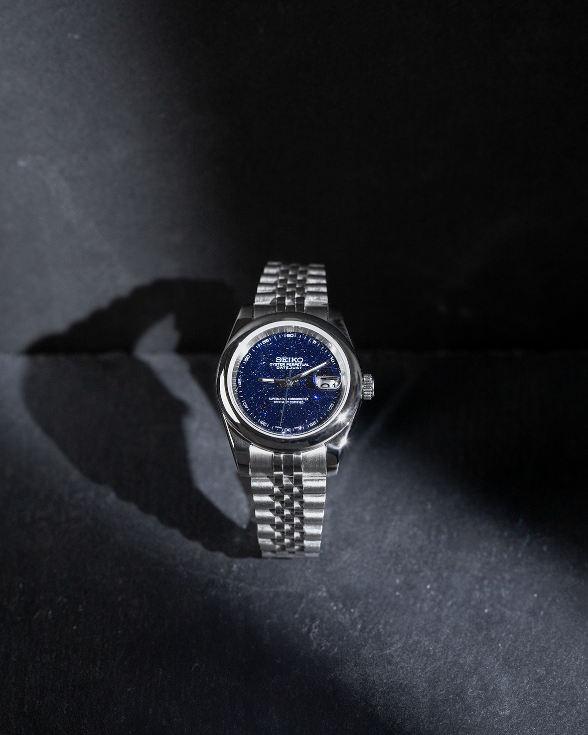
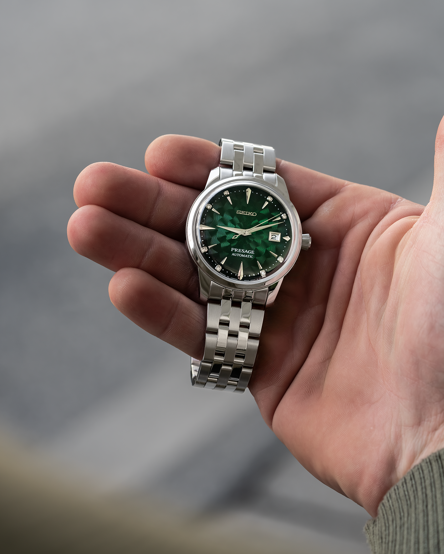
Simplicity is harder. A simple build has nowhere to hide. The spacing has to be right. The proportions have to make sense. The chapter ring can’t be a hair off. The handset can’t be “close enough.” The crystal choice matters more than people think—flat vs domed, clear vs slight AR tint—because it changes how the dial reads in real light, not studio light. When you strip the watch down to the essentials, every remaining detail has to earn its place.
That’s why clean designs often feel more luxurious on the wrist. Not because they’re trendy, but because they’re controlled. A quiet dial isn’t empty—it’s intentional. A tight color palette isn’t boring—it’s disciplined. And when everything unnecessary is gone, the watch finally has space to breathe. That’s the kind of “expensive” you feel after a month, not the kind you flex for a story.
 Over time, the watch evolves. It carries marks of daily life — subtle scratches, softened leather, the warmth of use. These are not imperfections. They are reminders of moments lived, places visited, and time spent.
In that sense, a Seiko Mod watch is never truly finished. It continues to grow with its owner, adapting, aging, and becoming more meaningful with each passing day.
And perhaps that is what makes it special. It is not just about telling time. It is about holding onto it, shaping it, and making it your own.